Having just returned from Macworld late last night, here are a few thoughts/observations:
A massive ecosystem
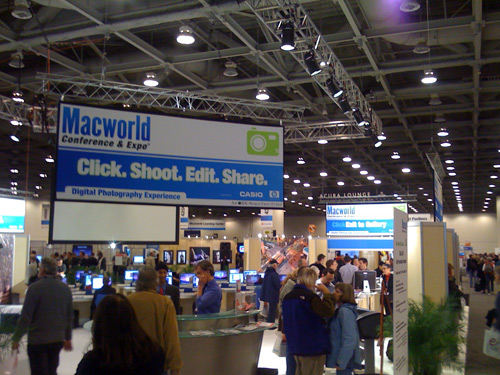
It’s striking to see how many companies have sprung up around Apple products. Nothing like cramming all these people into the same spot to make you realize how many there are. They filled two ginormous exhibit halls at the Moscone center in SF. It was sensory overload walking the floor and the energy level was almost uncomfortably high to the point where you had conference fatigue after a day.
Masters of buzz
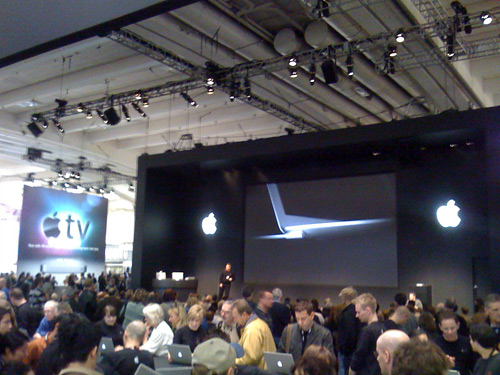
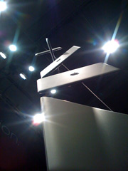 They certainly have demonstrated they know how generate buzz. Aside from having a stellar UI in their products they had amazing visual presence at the show. With these cinematic and creative displays you have everyone with a camera posing for pics with Apple logos in the background and then talking about how incredible the setup was (me case in point right now). As far as product launches, nobody needs the new Mac Air but the way they present it sure makes you want one.
What got the crowds
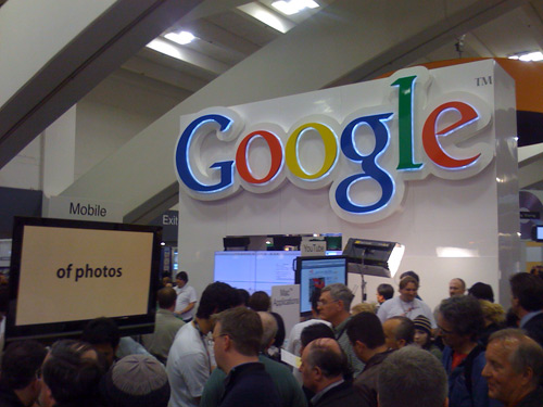
By far the most interesting thing for me was to see which booths drew the crowds. Every now and then you’d come across a booth that looked no different from any other and yet there would be 100 people packed around it watching a demo while the others were desolate. These ideas aren’t rocket science but the popular ones consistently had either:
a charismatic speaker
a product that visually demo’d well
a hot brazillian model handing out free stuff
an interactive experience.
This last one was the real eye-opener: whether it’s a game of chance that involved competing for prizes or some type of interactive demo where the passers by were projected on the video screen and then the demo somehow incorporated them- it’s clear that people like watching other people, not products. If your product can be presented in such a way to incorporate the people there in the demo itself, it’s guaranteed to attract viewers.
Interesting products
The two products that interested me most (aside from the new EVDO card from Verizon which I bought on site) were completely unrelated to Apple.
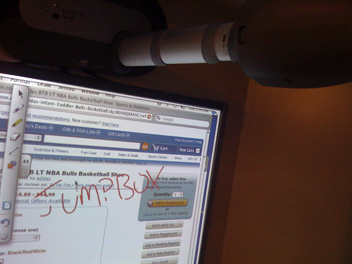
The company SmartBoard had some impressive options for making a digital whiteboard. Their most inexpenisve setup allows you to utilize your existing projector to project against one of their pneumatic screens. Using your finger or one of their soft pens, you draw on the screen and it senses the position, sends that data to the app and draws ink as if you were writing on a whiteboard. Because it’s essentially just a touchscreen for a projector though, you can do anything you can with a mouse (ie. surf web pages on a whiteboard, mark them up, capture the digital ink to a pdf and share). It had some pretty fantastic OCR features too that would transcribe a whiteboard full of notes into text. They had other more expensive options that either incorporated one of their plasma TV’s or allowed you to use an overlay on an existing television screen. This seemed like a killer feature for teams that do a lot of brainstorming and it has a solid “wow” factor for anyone who relies on making a stellar first impression when collaborating with a client on a whiteboard.
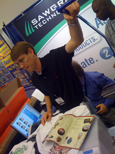 The other one that really grabbed me was Sawgrass. They provide an alternate method to creating t-shrits that involves dye sublimation printing with heat transfer vs. the typical silk screening process. It’s not a revolutionary technology but what’s impressive is the vibrance of the colors, how it doesn’t alter the feel of the shirt and the affordability of the system. It seems like it could enable a creative t-shirt company to bootstrap its way into a real business without much up front cost.
Parallels took best in show for the 2nd year in a row. We’re happy for those guys. As their largest virtual appliance vendor currently, we love to see Parallels being received well. Their new Parallels server product looks slick and has all kinds of neat features that should make it very appealing for anyone who is heavily invested in OS X. That beta just started accepting signups and you can apply here.
Lastly, Zimbra is looking really solid. We’ve had numerous requests for a Zimbra JumpBox and we hope to eventually deliver one as it’s something we want to start using ourselves. I was impressed with how responsive Zimbra was running in Safari 3. It’s almost indistinguishable from a desktop app and I’m assuming the offline access is even snappier. They’ve also bundled in a chat server (jabber?) to the latest version so you can have a central, searchable place for IM transcripts to accumulate for your company which is very cool.
Conclusion
If you’re into Mac products this is an impressive, high-energy experience I would recommend attending. The Mac market may still be a fraction of the PC market but the passion and vocal nature of its constituents means it moves twice as fast. The companies that ignore the Mac market citing present figures are going to kick themselves when its size rivals the PC market because by then they will have missed the boat.

 This very situation happened to me a month ago when I was at
 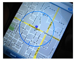 The solution: When you park your

 They certainly have demonstrated they know how generate buzz. Aside from having a stellar UI in their products they had amazing visual presence at the show. With these cinematic and creative displays you have everyone with a camera posing for pics with Apple logos in the background and then talking about how incredible the setup was (me case in point right now). As far as product launches, nobody needs the new Mac Air but the way they present it sure makes you want one.

 The other one that really grabbed me was


