I like to support artists as much as the next guy but the fact is when you’re in a startup what little money you earn goes towards essentials, not luxuries. But having bare walls is uninspiring and a few small comforts go a long way. So I came up with a fairly inexpensive method for solving this problem and figured a I might as well document it. My goal was to get a giant 6’x4′ color print of a beach scene on my bedroom wall for as cheaply as possible.  This is my $35, two-hour solution that yields a satisfactory (albeit somewhat ghetto) alternative to buying an enormous single-piece print for hundreds of dollars.
Find the art
So first you’ll need to find a digital photo to use that’s hi-res enough where it won’t look completely pixelated once you blow it up to scale. I used the Flickr search and scanned through hundreds of beach scenes before I found a couple I really liked. Sorting by “Most interesting” made the search quicker (btw, you have to click the “all sizes” link on each photo to find one that has a resolution of 2000 pixels or more). Once you have a pool of candidates then you have the difficult task of boiling it down to the right one.  I decided if this is going to be a photo I’ll be living with every day, it was worth “living with it” as wallpaper on my laptop first to see how I would like it over time. So I installed an app on my Mac called “Desklickr.”  This is  a neat little donationware app that lets you automatically swap your wallpaper periodically and feed it with your Flickr photos that you’ve favored.Â
Prep the art
Once you decide on the one you want the next step is to cut it up. Â Photoshop is the ideal tool. You’ll probably be printing panels of the scene on 8.5 x 11″ paper so first thing is to size the image appropriately. Â Use the Image > Image Size option to scale it, uncheck Resample Image and set the width to the target width of the desired final print (in my case 6″ or 72 in). It will tell you your resolution (your res will be pre-ordained as it’s not resampling the image):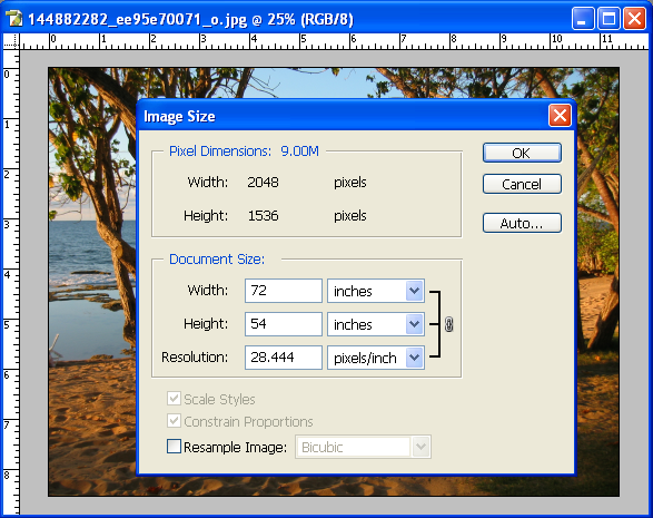 Next you need to grid out the scene and slice it up. Â Whatever your individual panel size is (again mine was 8.5″x11″) make a selection box that is exactly that size and put it in the upper-left corner. Â Make sure that under the View menu both Rulers and Snap are checked. Now all you do is drag the guides from the rulers across to the boundary of your select box. This is a little tedious but as long as you have the snap settings enabled it’s not bad – drag a ruler, then drag the box, drag a new ruler, etc. Â Do this until you’ve gridded out the entire scene like so:Â
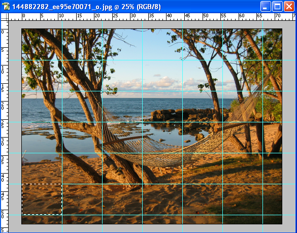 Now you’ll have some scrap on the right and lower edges. Crop the picture until it has only full panes (in my case a 6×6 grid). If you want to make any color adjustments to the image, now is the time.  You can get crafty and use the paint effects if you’re looking to simulate a watercolor or pastel piece of art.  Once you have it looking the way you like, it’s time to slice it up.  My antiquated version of Photoshop has a slicing tool that unfortunately assumes you only ever want to output .gif files for use on a web site.  Gif’s mean unacceptable compression for our situation though so we’ll need to bring the image into Imageready and use the slicing feature there. Once in Imageready simply do Slices > Create Slices from Guides to get this:
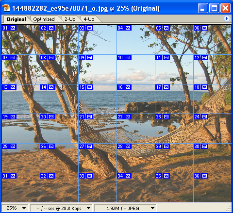
Do File > Save Optimized As and choose “Images Only” (as HTML has no place in the real world). That will output a bunch of .jpg’s in a directory. That’s all we need now in order to print it up.
Print it
I printed mine at Kinko’s. If you have the patience you can use their online print tool to send the job but there’s no convenient way to add a bunch of images in one step. I found the bandwidth of burning a disc and delivering it via car to be faster than their online tool for this job. I printed on standard paper and instructed them to cut the white strips off the sides so that there was no bleed.  The entire order of 36 color prints cost under $30.Â
Hang it
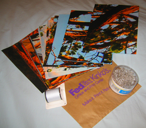
The last step is to hang this sucker. This is the most time-consuming part of the project and to do it right requires that you lay down a grid on the wall to get it spaced correctly. Â If only it was as simple as dragging guides in Photoshop…
For this step you’ll need thumbtacks (ideally 4 for each pane plus some extras for doing the grid) and thread. Â Figure out exactly where you want the print to live and make sure it’s right because once it’s up, it ain’t movin’.
The best thing at this point is to tack up one or two of the panes and figure out the spacing you want between them. I found about a 2″ gap between them was right. Stub out a few and then mark the upper-right corner of each with a tack. Snake the thread back and forth making the evenly-spaced horizontal and vertical rows flush with the upper-left edge of each pane. You should get something roughly like this:Â
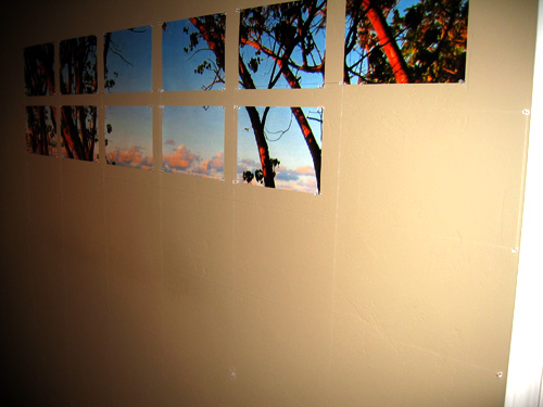 Now it’s just an exercise in pain tolerance as you plug ‘n chug through tacking in the rest of the panes. Â WARNING: now is no time for pride, get a thimble (or a bottle cap if that endangers your ego- some kind of thumb protection). Â Tacking 150 pins into a wall I’m pretty sure is a twisted form of torture reserved for special criminals – Â your thumbs will hate you for it (mine do days later). Â After a solid hour of tacking you’ll wind up with an end result something like:Â
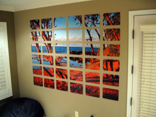
The one thing I might recommend in retrospect is doing a proof with the entire image shrunk down to a single page in order to test how the colors will translate. This image turned out a bit warmer than it appeared onscreen. Fortunately it’s a sunset so that only enhanced the glow of it but the only true way to know how colors will print is to print out a small scale version first.Â
There it is though: a starving entrepreneur’s pre-IPO substitute to expensive wall art. I’ll update this post with the post-IPO version someday ;-) Hopefully this helps a few other startup ramen eaters to fix their empty wall problem and get a much-needed relaxing beach scene on their wall to enjoy.


